Acro
Background
Located in the financial district of lower Manhattan, Acro was established in 1976 and has since been a leader in producing and handling documents for the legal and professional services industries. Acro’s core competencies include copying, scanning, printing and shredding, while offering an array of other finishing and binding services.
Acro’s relationship with Voom Creative began with them as our print vendor before developing into a two-fold partnership. After we experienced firsthand how seamless it was to work with Acro, we knew we could help them further leverage their longstanding reputation of quality work by creating a new brand identity to match their services and values. Acro then hired us to rebrand their company, and the bilateral partnership was born.
Services
Brand Strategy, Brand Design, Marketing Collateral
Industries
Commercial Printing, Business Services
Award


One challenge Acro experienced over the years was numerous requests for photo processing services due to the company name of “Acro Photo Print Inc.” Before creating a new logo, we recommended removing “Photo Print Inc” from their identity to help curb that confusion.


We started the rebranding process by creating a new logo for Acro that better represented the company’s services of copying, scanning and shredding. The icon portion of the logo consists of two sheets of paper: On the left, the sheet has a concave bend to signify paper coming out of a copy machine. On the right, the sheet represents shredding while also symbolizing the reflection that takes place when scanning a document. Both sheets come together to form an “A.”
A fresh, more vibrant color palette and sleek typeface palette was formed to evoke a feeling of excitement and modernism.


The brand elements developed, including patterns derived from the shape of the logo icon, created a unique new brand for Acro. We designed a brochure to highlight the benefits and services of Acro and carried the new brand design into other sales and marketing collateral, such as post-it notes, thank you cards, packaging, labels, logowear and more. As a result of creating the new Acro brand, we won a 2019 MarCom Gold Award for the logo.


“My first interaction with Voom Creative was through them becoming a client of Acro. My communication with Voom was clear, friendly, and genuine, so when they approached me about revising my brand, it seemed like a natural partnership on top of good timing. The transformation of my brand is a breath of fresh air and I’ve received so many compliments from my customers on our new look. The Voom Creative team is very creative and responsive to all of my needs and requests. The entire process was seamless. I highly recommend Voom Creative.”
Steve Bianco
President, Acro

Related Work

A-Plus Transportation
Brand Strategy, Brand Design, Marketing Collateral

Custom Cap & Tire
Brand Strategy, Brand Design, Web Design & Development, Marketing Collateral
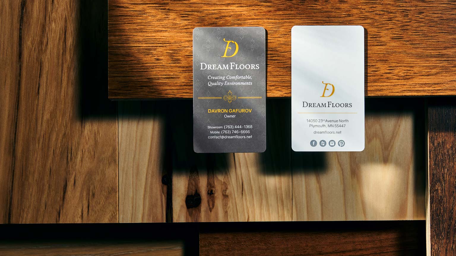
Dream Floors
Brand Strategy, Brand Design, Marketing Collateral